Spotlight on Hudson Interiors
Welcome to The Good Life.
Don’t go too crazy, but today on deck we have the designs of Hudson Interiors, the lovechild of Jill Goldberg. Her work feels appropriate, or rather, follows a trend; after last week’s designer spotlight went and got all autumnal, I decided it was only right to follow that up and another take on an old classic. Or something.
I’m a particular fan of the way Hudson channels a certain barn-house-by-the-lake vibe, but does so with a fresh coat of paint, if you will. It’s comfortable, in that way Georgian estates are–the textures at work suggest you should be walking around in slipper-feet, getting curled up under thickly knitted blankets–but it’s cleaned up. It’s maintained. The result is this sort of classic/modern/rugged/refined hybrid. Don’t doubt Hudson’s ability to incorporate every imaginable design trend into one space. But definitely doubt my ability to articulate visual design in words.
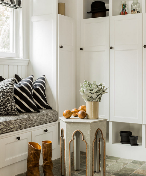
A clearly defined and spacious entry is really all most of us can hope for in this life, and this one, bright and white, with plenty of storage is, well, it’s acceptable.
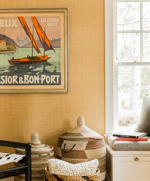
I happen to be quite a fan of retro posters. This one begins where the grasscloth behind it does before jumping out to the ethers in perfectly complementary hues. And that bench cushion (look closely) almost seems to me to resemble a tweed blazer. How very nicely academic, isn’t it though?
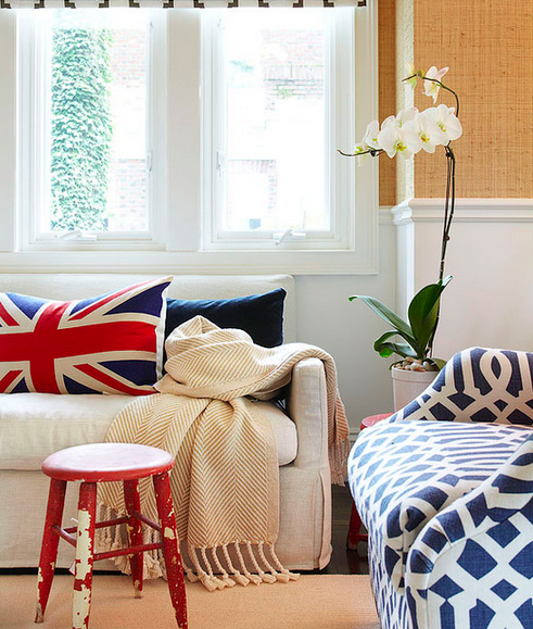
Since having British clients, I’ve developed an unapologetic fondness for the use of the union jack in design. Really, Hudson had me won over with that pillow, alone. The herringbone throw and generously distressed little red stool didn’t hurt either. And I don’t even like red. In fact, its rawther my least favorite color, at least in regards to interiors.
This place is good. The entrance to an estate should be grand, and this one is that, but it’s also deliciously mellow and unpretentious.
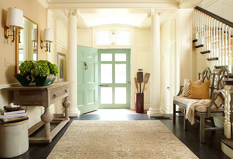
Like, you might actually consider it appropriate to sit on yonder bench whilst you lace up your booties, or put your canoe paddles in the umbrella stand by the door at the end of the day.
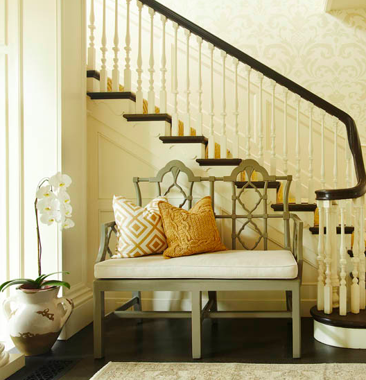
A personal favorite of the bunch– this space gets me all giddy.
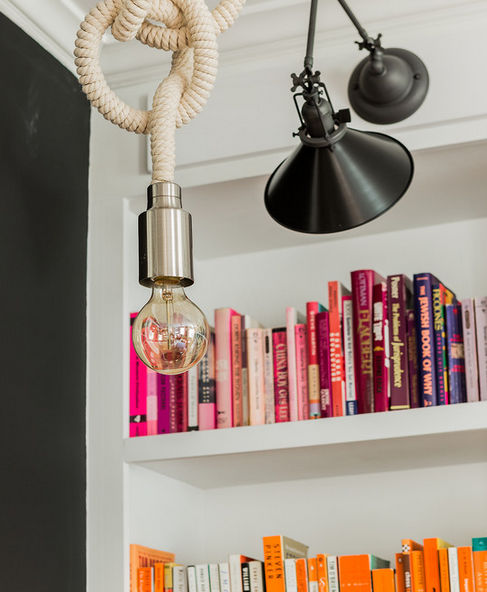
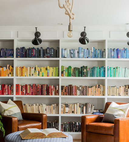
Listen, I know arranging books by color isn’t for everyone and that’s fine, but I can’t help the fact that the sight of a wall of built-ins, filled with the rainbow incarnate and paired with a couple of leather chairs that look like butter makes me want to pump my fists and get all groovy.
Nor that gold stripes, in any form, make me want to do the same.
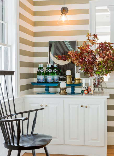
Another great poster amid the backdrop of a fabulously rich navy wall:
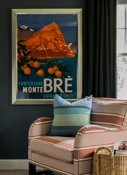
Which brings us to the pièce de résistance:
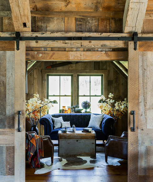
Is that good or is that good? It’s barn-tastic, is what it is. Tuft-tacious. Globe-ular. Navy-bulous.
You know what?
At least I’m trying and that’s more than I can say for you! (Unless you comment and then I’ll be your best friend again and invite you to my birthday party that’s in -6 months.)
Make some time this weekend to attend to that one stupid task you’ve been meaning to for months, I beseech you, and maybe while you’re at it, cook a spaghetti squash, clean out your hairbrush, and spread the Simple Love?
3 Comments
Leave a Comment
Other Posts You May Love
3 Comments
-
Wow! I absolutely love this design. Thanks for the introduction! xx
-
Fantastic design – greats pics – great work Thankyou 🙂
-
Great stuff, Annie!! Loving the retro posters, the Union Jack and the entryway!!
Leave a Comment
Welcome
Search The Blog
Simplify Your World
Sign up for the email list to get inspiration and simplified tips sent right to your inbox.
On Pinterest




Wow! I absolutely love this design. Thanks for the introduction! xx
Fantastic design – greats pics – great work Thankyou 🙂
Great stuff, Annie!! Loving the retro posters, the Union Jack and the entryway!!